Sales Comparison
The Sales Comparison graph is a line chart (or table) showing net sales as the Y-axis value and the week end date as the X-axis value. The graph includes a line for each item being compared. The data displayed is filtered by the provided filter criteria. Moving your mouse pointer over a point on the graph displays the sales amount for that week and price point.
What You Can Do
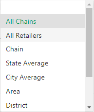
Display sales comparison by retailer location
Display corporate sales comparison
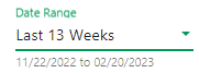
Display data for a different time period
Filter data displayed on the screen
Display data in the Line Chart view
Display data in the Tabular view
View the Line Chart in "Full Screen View"
Add or remove data lines from the Line Chart
Print the Line Chart data displayed on the screen
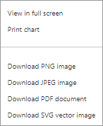
Download the Line Chart data displayed on the screen as an image
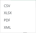
Export the data displayed on the screen

 . The following pop-up window displays: